Animatronic Design Blog
Best,
- Darrin
Design Exercise #1:
Pop-Up Character
part 9: Some Quick Story Work and Character Sketches.
Darrin Hughes - April 23, 2021
First a disclaimer apologizing to people of Irish descent for what I have no doubt would be considered cultural appropriation. I am a history buff but am not strong in the lore of the UK. Although I do have some Irish blood and I made what might be called a glancing attempt to connect to a historical baseline, I don't expect to be able to defend any of the story decisions beyond my own immediate response to what seemed interesting and fertile for exploration yesterday afternoon after grabbing a few books and doing some poking around the internet to build on a concept I'd started decades ago when I was even more naive than I am now. Having said all that, damn the torpedoes...
Glancing, Selective Look at History
From all this I took a few big-stroke elements:
1) Mention in one of the references of the original tribe "coming out of the mists", which I chose to connect dots with an imaginary group of homo floresiensis leaving their Indonesian island, building raiding skills and population over decades as they migrated diagnally across Eurasia. Let's suggest that "going West" became a part of their cultural identity, searching for some form of promised land.
2) The Tuatha De Danann being ostracized to life underground after being removed from power in 1700bc by the Milesians. There are traditions of the Little People secluding themselves in caves, trees and water.
3) The Tuatha De Danann were magical and god-like.
From those elements I made up some rules:
Wood, Stone and Water - Some live in the water, generally females. Leprachauns are often depicted as always being male, so I decided to make water-folk women and underground (stone) folk men and they would then have to somehow get together to keep things going. And then I let those that live in trees be male or female and have generally a separate society from the Stone and Water folk, with perhaps some internal cultural biases between those main groups. I broke from evolutionary timetables with great abandon. For example, forest-dwelling Wee Folk have plant-like features - for no other reason than it seemed fun to me and would add to the 'hide-and-seek' element of the Pop-Up figure concept.
Size - All Little Folk are 2'-3' tall, have proportionally large heads and stocky build.
Hair & Tatoos - A wide range of styles of facial hair and dark tatooing are tatooing (think Maori) are common and used to help support hard breaks.
Temperment - These characters are mischevious but not evil or angry. If this was D&D, they would be Chaotic Neutral, being tricksters for the sake of being tricksters, but with no malice.
Magic - Their 'magic' is mainly 'invisibility' - their ability to live unseen by modern humans, and a deep knowledge of natural pharmacology. No pots of gold, just beautifully crafted tools and decorative items.
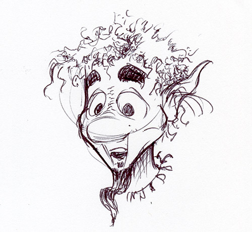
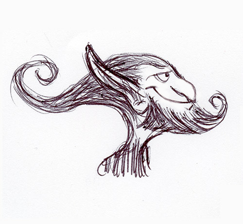
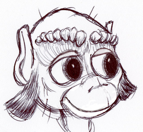
Of this first set of quick sketches, this one came out the closest to a male protagonist. I picture him with a dark brown woody skin and his hair as a bushy moss of some sort. He looks disconcertainly like Rand Paul to me, but maybe I can add in a little Ru Paul to even things out a bit.
I would need to do a study to figure out the breaklines near the chin. I'm guessing this character might need a small section of silicone skin to allow the upper lip to deform into a smile
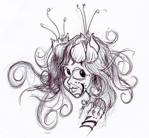
I did a few quick female characters but this was the only one was worth showing - still need to find a groove with this class. It's not drawing women that is difficult really, but we draw such a fine line with beauty that when you start to exaggerate features, things quickly start to read too harsh. I feel like it takes quite a bit more care to come up with effective ways to portray women without falling into traps.
As a consequence, this young princess-like character was quicker to get to. I'll work on building out a more even gender representation.
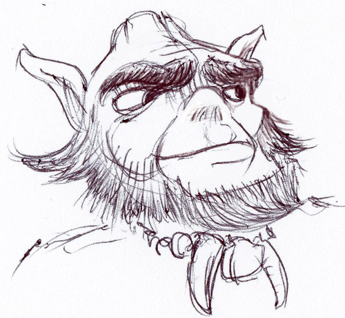
This dude is all hair. There doesn't need to be that much underneath, just enough to keep the shape defined and let the wig do the rest.
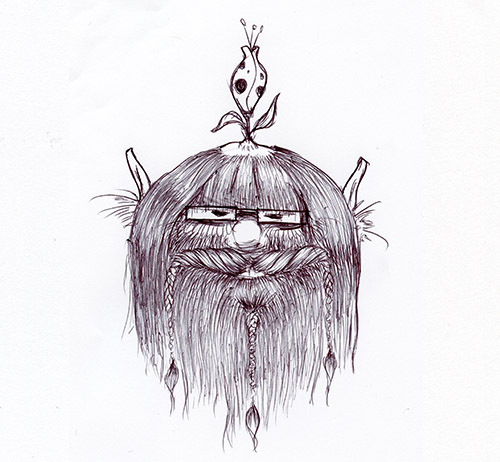
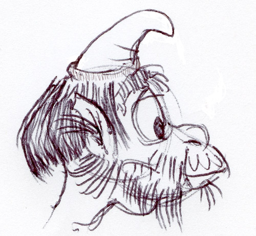
I know this guy looks maybe more Scottish than Irish with the braided hair. Can't decide if he's an homage to Henson's Animal or the Addams Family's Cousin It. Either way, I kind of like him, except maybe the spectacles - was having trouble deciding on an eye treatment. Couldn't resist giving him a bald spot with a flower growing out of it. Not sure why.
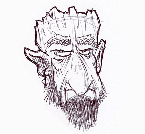
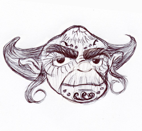
This guy came off as being very serious. After getting his lower face worked out, I decided to give him sort of a crown-like helm that looks like he chipped it out of his own skull. No doubt he's a teddy bear on the inside, but I like the idea that he looks as rough as sandpaper.
I kind of feel like his nose is a bit too human - kinda want to make it look like part of a tree trunk or somehing. Probably just needs some textural detail and color to make that work.
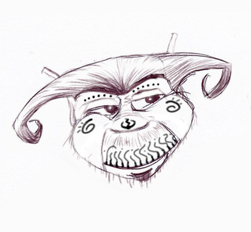
As I was working him up I was focused on keeping his mouth small with facial hair to help cover the break lines and he came out rather prim and refined-looking, so I gave him a crown-ish head-piece. He ended up looking more like a young prince than a king. Not sure there needs to be much royalty anyway, so he may be heading for the bench.
I have been thinking that the tree folk build up their camouflage as a symbol of status and maturity, adding elements and including physical objects physically attached to the skin. I'll detail that out in the future.


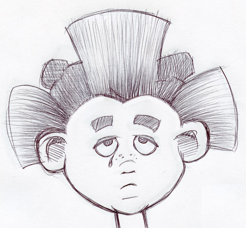
I was mainly focused on giving this character a dead-tree-looking headpiece and a slightly longer face than the others and he came out pretty Grinch-like. That's not necessarily bad, but I'll probably look for ways to make him less reminiscent of other characters on the next pass.
As with a number of these, the brows are likely to require a different approach than I discussed with Rai - I'd need to look at each one individually to figure out a viable path.
I didn't get very far with the rock-based characters. My first thought is that they are less hairy overall, but have interesting and unique 'tufts' of hair and are more focused on using small stones to accent their features and with tatoo decoration. I like the idea of using small stone-like shapes for eyebrows in particular because that opens up some additional options for how to make eyebrows with broader expression using elastic material between or underneath each hard element.
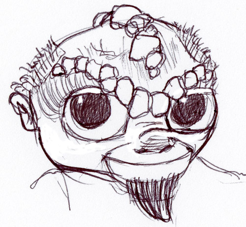
This isn't a particularly good example, but I like the idea of introducing tatoo art for the rock folk not unlike that of Maori tradition. I've been a fan of that stylistic body art since I was a teenager and feel it works well with Gaelic decorative traditions.
I started playing with large hair shapes a bit. As you can see from some of these examples, I introduced spirals into the design quite a bit, often with hair curls. I'm not totally sure how practical that is, but I like the idea.
This quick sketch probably demonstrates what not to do. With the presentation constraints we've set, it's going to be rare for the audience to see the figure in profile, so making things most interesting in that plane may not be the way to go. Having the face-front shape read as interesting is probably a better direction to focus on.
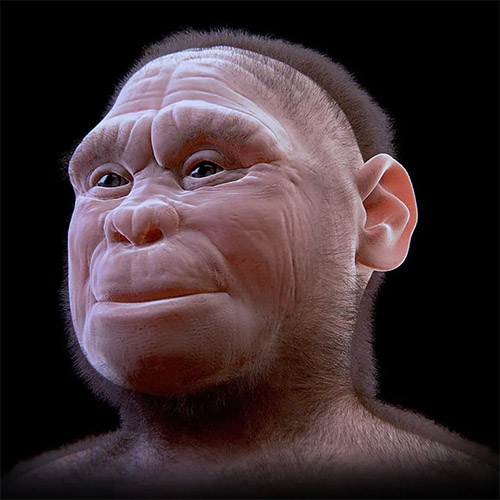
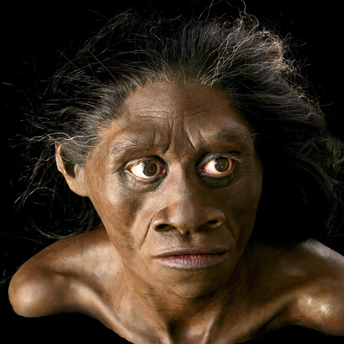
You have to cover a lot of cultural ground when doing story and character work. Some of the looks I experiment with, while working with variants of humanity, tend to have an ape-like quality - the result of squashing and protruding the muzzle, creating deep smile lines that connect the nose, mouth and chin, exaggerating brows and lips, etc. I'm doing that on the one hand for mechanical design reasons, but also because I genuinely like forms that aren't flat - I naturally prefer shapes with some meaty topology. Unfortunately, that can result in bringing up questions of ethnicity and racial stereotypes that have often been portrayed negatively and which I would certainly not want to reinforce. My opinion is that it is the negative protrayal that is the root of those issues and not the forms themselves. For the moment at least, I've chosen to manage that category of issues through character development and storytelling and not get too bogged down into over-anglicizing the character features themselves. I don't buy into eugenics at all, so would rather meet it head on and utilize a wide range of forms responsibly rather than dance around those concerns and make all characters look like Anglo-Saxon royalty. Still, I know this is sensitive territory for many. Others will certainly have different opinions and I welcome discussion on the subject.
I kind of like this little guy. He has a baby chimpness about him (see issue in #10), but maybe with a little refinement I could age him up just a bit and give him a bit more maturity so he could hold a position as protagonist, like perhaps a best friend to the young tree folk character (#1). Pairing them up might be useful so they can communicate to the audience through each other as they go on their journey to find out what the good and bad of humanity is about.
Design Exercise #1:
Pop-Up Character
part 8: Tech Spec Recap - Moving on to Story Development.
Darrin Hughes - April 22, 2021
Head & Shoulders Only - We will lift the head and shoulders into place as if the character is popping up from a hiding place, but will either not show arms and hands at all below the shoulder, or add in special functions for appendages as needed outside of the primary pop-up figure design.
Self-Contained Portable Unit - The figure will collapse into a container with some level of protection on all sides, with all elements reqiured for a performance contained within with the exception of a power connection (common 120v utility power) and possibly a connection for audio amplification.
Overall Size Constraint - Scale limited to accomodate use of servos that can be run using common utility power. This is a wild guess on my part - not based on any specific engineering solutions, just a general appreciation for the amount of energy required to make things move under adequate control. Think more soccer ball than basketball and we'll avoid a general skull size bigger than a basketball.
Robust Face, Head and Upper Torso Controls - These three areas will be as tricked out as we can get them and still be buildable and fairly reliable.
Small to Medium Mouth with Puppetry-Focused Breaks - We are going to try and avoid using skin or stretch fur when possible, or at least limit the amount and thickness required. We'll revisit mouth design character-by-character once we have other things worked out. In some cases we still may utilize elastic materials, but will keep that to a minimum and deal with on a case-by-case basis.
Video Eyes with Single-Axis Circular Arc - The eyes will either have a regular circular curvature about the Y-axis (Y-up) or have a flat, planar orafice. The area immediately around the eyes will support a rectilear display (leaving space for corners) with tight tolerance around the eye opening (a modeling/sculpting requirement). Eyelids will be part of the media display.
Rigid-Body Eyebrows - Brows that work well with a single rotational axis near the outside edge.
Passive Hair - Utilize passive elements like hair, hats, beards, ears, earrings and other adornments that can provide natural motion without actuation.
Reliability/Maintenance Strategy - In order to hit all of these objectives it is likely that we will need to accept a higher maintenance profile and replacement rate for parts that is common for ride figures. So modularity and quick-replacement strategies will need to be included in the specifications when the project gets to the Schematic Phase. For now, that just needs to be included in any estimating and feasibility evaluation that gets done.
So now I think we have enough feedback on the technical side to go back into story and character development. I'm going to toss Rai here into the trash bin and come up with something else (sorry Rai - another time dude). It would be great to have an intellectual property that meets our requirements, so let's invent one.
As I was thinking about this next part of the project this morning I remembered a story treatment I'd done back in the mid-80's when I was first moving toward character animation. At that time, I'd been reading a bunch of Irish folk tales and some of the history behind them and really liked the idea of Pookas, Banshies and Leprechauns as real societies anciently respected, then unfairly demonized to squash pagan beliefs and then over time totally forgotten except in nursery rhymes and fairy tales - then suddenly thrust back into dealing with the modern world. Anyway, the concept revolved around fairly small, exaggerated characters that keep themselves hidden from humans most of the time as an integral part of the narrative. Thirty five years later, the storyline could certainly use an update, but I think its at least consistent with our needs here to justify using the concept as a prompt.


As a story framework I'd like to sprinkle in something I've been mulling over for a while now... What would happen if a tribe of homo floresiensis (the 'hobbit' people archeologically found on the island of Flores) showed up today, confronting and being confronted by modern society. How accepting would we be? Would we accept them as human - as equals? It seems to be a rich row to hoe given the challenges we still seem to have within our own very narrowly varied species in getting past subtle differences in skin tone, anatomy and culture. Sifting homo floresiensis through a filter of Irish folklore is, in my mind, a way of presenting it to a larger audience through character animation in a manner that is a bit less literal but, hopefully, still powerful. The intention is to use the art form for its strengths. To do the work of art - to get people to think - and be viable as a commercial commodity. The connection with the science of archeology may or may not be explicitly made clear in the storytelling, but it feels to me like a good foundation to build upon.
Anyway, that is my thought - to merge our changing understanding of human development with folk tradition and then work that into a storyline that has relevance but doesn't hit the nail too much on the head. And then pretend that has been turned into a film - a popular film while we're fantasizing - that justifies using the IP for location-based entertainment pop-up animatronics.
Although this started out as basically a technical exercise, I don't see why we shouldn't just grab the bull by the horns and follow the project as it evolves. Since, so far, this is really just a conversation I'm having with myself, I'm going to keep driving that evolution. I welcome any input from any source that has an interest in engaging and possibly steering this in another direction.
Design Exercise #1:
Pop-Up Character
part 7: Mouth: General Issues & Principles.
Darrin Hughes - April 21, 2021
Below is a quick set of dialog mouth shapes (visemes) - I just took these of myself with my cell phone. If I were doing an analysis for a specific figure I would put some time into this effort, label the visemes with associated phonemes, include performance notes and then line up the images with markers to track displacement from a neutral position. I'd look for a stronger model (an actor closer to the character than myself). Not necessarily human - if its a film animation character I'd use animation samples, a model sheet, and a production rig if I could get it. We want as much of a representative expressive gamut as possible and then focus on specific dialog (if available).
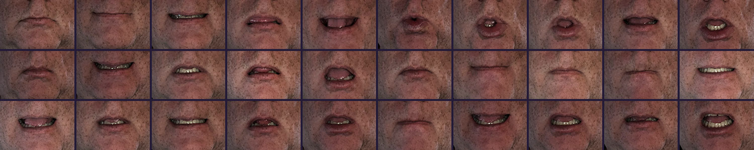
There's a reason I didn't label these shapes with viseme labels - I didn't want this to be taken as definitive. It's sometimes assumed that if you take a script and list out each phoneme in the script dialog on an exposure sheet, make it accurate to show timing using the audio track, and then drop in viseme data (e.g. blend shapes commonly on a CG rig) that process will result in great mouth animation. Usually, however, this results in over-articulation. Any given viseme can be thought of as a transition between the one before and the one after and those transitional shapes aren't always exactly the same. When you analyze actual mouth motion there is much more efficiency in how those transitions are executed than represented by a phoneme-by-phoneme exposure sheet. With animatronics it gets even messier because there is often a latency in the system that can be different from actuator to actuator, adding little bits of error to the timing.
The image above is meant to just provide some general reference for the type of range involved in basic naturalistic human speech - to show that there is a lot going on even just with basic dialog shapes. A more nuanced video analysis would show additional layers of subtle movement. The elasticity of our skin and muscles are simply amazing. And as humans we tend to do little else than stare at other people talking for most of our lives - we know this stuff even if we don't know we know it - until it looks "wrong".
Another thing to note is that while there are consistencies and rules for human mouth deformation, there is a surprising amount of uniqueness from person to person. There can be tremendous variation even from the same person sampled at a different time. When excited and full of energy a persons' visemes can be quite different than when reciting the same dialog late in the day, when tired or in a different mood. There are risks at both ends of the spectrum - risks in over-generalizing and also in getting too far in the weeds trying to replicate every nuance. Setting an appropriate bar for success is an important part of good creative direction for animatronics, as is just having a really good eye for character performance and an understanding of audience perception.
Here's an example of a naturalistic human I pulled from the internet...
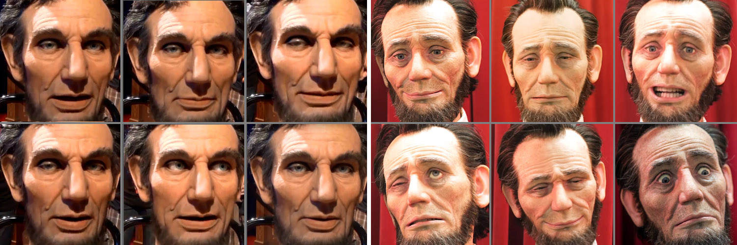
The left six screenshots are from a WDI Lincoln head done a while back and the six on the right are from one done by Garner Holt Productions (GHP). Both teams put a lot of careful design work into their effort. GHP's certainly has the ability to create a wide range of facial expressions but if charged with animating Lincoln in an actual show, like "Great Moments with Mr. Lincoln", or "Hall of President's", I doubt there's much an animator could do with it. The more restrained shape changes in the WDI version provide a much better toolset for the animator to use for a show featuring Abraham Lincoln, unless perhaps he's killing zombies or in a screwball comedy. Much of the control on the WDI figure appears to be in jowl shape changes (which don't really show up in this still images well). There doesn't seem to be a ton of displacement in the lips and teeth - there is some, but it's pretty subtle. Still, I'm confident a good animator could get the combination of those cues to read pretty well in a theaterical environment. Now, to be fair, the GHP Lincoln may have been built more as a marketing tool than for a specific show solution, but for me this comparison illustrates the importance of designing to the character and to the show. There's also the issue of maintenance. The GHP figure would need to prove it could hold up under high duty-cycle requirements. Having to replace a face skin every few days wouldn't be acceptable.
One last note - When I'd animated older versions of Lincoln in the 90's there were a number of lip controls, but they were too subtle - they didn't read well enough from the audience POV to really be helpful, resulting in his mouth looking more puppety that I would have liked. It's a delicate balance between not having enough and having too much.
From here on out, we are going to focus more on abstract character design, like that of our Rai character. Human expression is still in the background, but there will be quite a bit of exaggeration and abstraction involved in our decision-making.
Let's look at a few other installed examples:
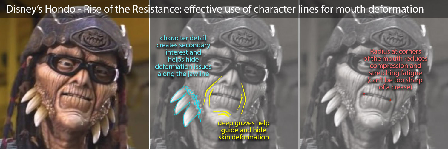
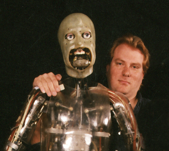
Hondo is a pretty well-designed figure for many reasons. He is a great choice of a target character as his facial details really help manage many of the issues that tend to crop up when using face skins - mainly helping to steer silicone compression and extension in ways that reduce fatigue and tearing and hiding spots where the skin is likely to bunch up and wrinkle. A few of the advantages are noted above.

Mr. Potatohead used his giant moustache to concentrate complex shapes on the lower lip, making it possible to make some pretty effective mouth shapes.
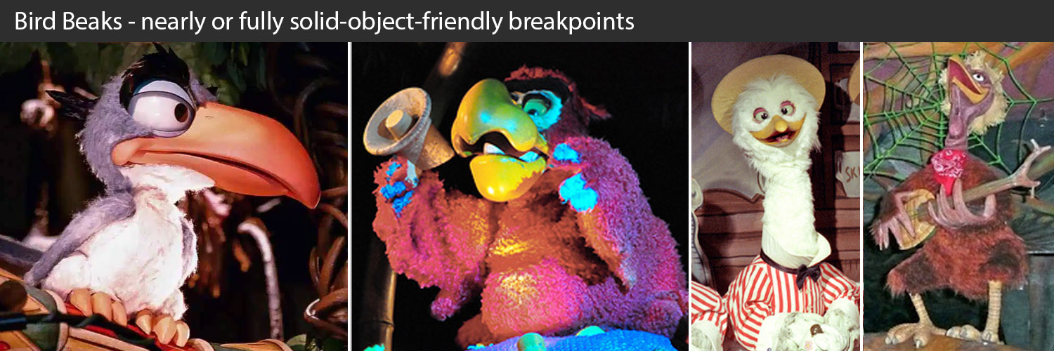
Bird characters can make mouths much easier. Even if the film version of the character does physically impossible things with it's beak, the audience intuitively understands a beak as a solid object and is a bit more forgiving when it just opens and closes, as long as it does so well - quickly and without hard mechanical hits or other distractions. This reduced level of expectation is a big help. Beaks can get big and heavy quick, however, and that requires bigger actuators and more structural support. Also, it's often helpful to have the upper beak move too, usually linked mechanically with the lower beak, either with a 1-to-3 or 1-to-4 ratio so the lower beak still handles most of the displacement. This does add both mechanical complexity (the linkage) and figure finishing challenges (movement has to be accomodated very near the base of the eyes).
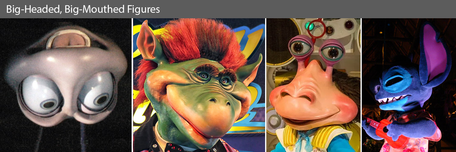
Exaggerated mouths definitely can grab an audiences attention. Keeping the audience engaged if there isn't a lot of variation in shape with a mouth taking up 1/3 of the total head mass is another matter. The solutions for each of the characters shown here varies quite a bit. We'll probably be better off trying to avoid moving large masses like this from inside the head of our pop-up figure. Better to use a design that has a less prominent mouth if we can.
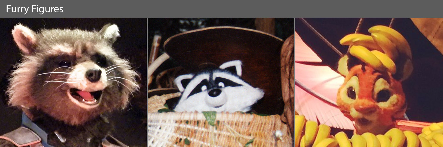
Like most options, fur has its advantages and disadvantages. When kept looking good, it can really help bring a character to life, as well as help hide some issues. For example, a section of fur can overlap another section to pretty effectively hide a hard break line, when that can't really be done easily with skin (without adding hard-line adornments like bracelets or necklaces). But its stretch properties, to date, are even more restrictive than with silicone skin, so the amount of deformation has to be carefully constrained.
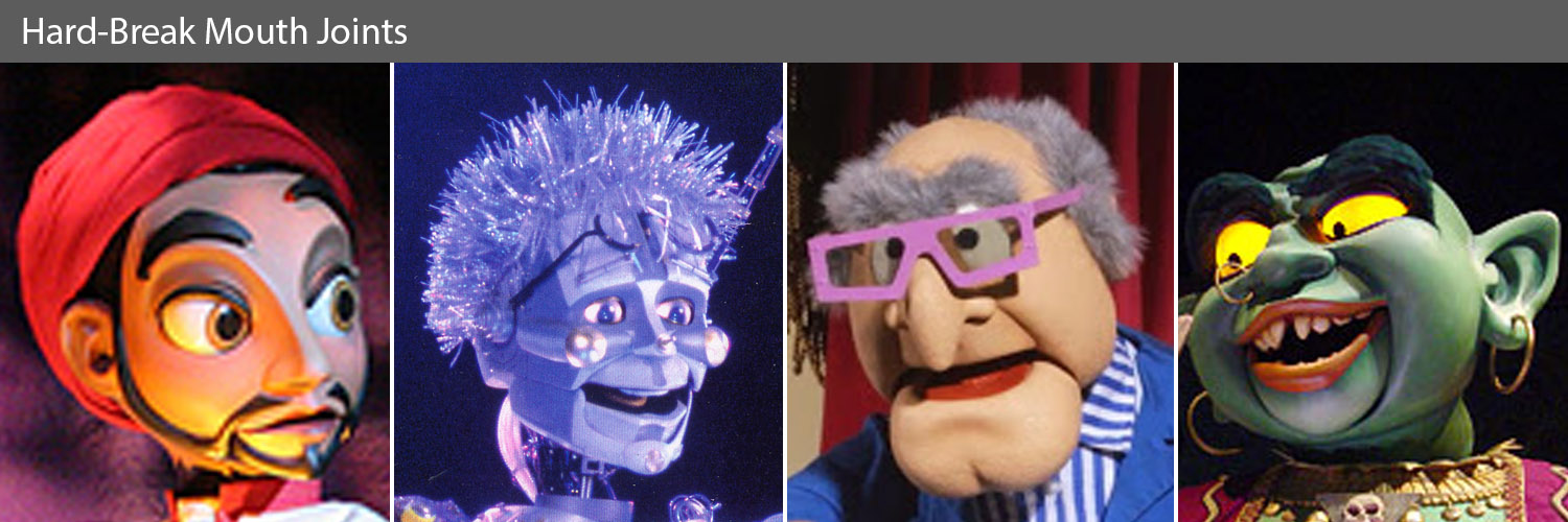
Probably the most efficient design path would be to design a set of characters specifically for this pop-up class, even perhaps creating the storyline around something that helps explain hard mouth breaks away. The Sindbad team did this, with the character design effort led by Larry Nikolai. The hard breaks weren't completely hidden, but the design reduced their visibility and introduced other hard-edged character elements to help make it work as a whole. Timekeeper had the advantage of being a robot so in addition to being able to just leave breaks in the skin, we could expose raw mechanics to reduce figure finishing issues. The Muppet characters have to work in the physical world already, so those characters were initially designed with many of the same constraints. At the far right is the Genie from Sindbad - a second nod to Larry Nikolai.
I believe this is the road I'm going to recommend for this project, that we (or I guess "I" since I haven't received any feedback) settle on modifying the character design so we can use lightweight shells or similar rigid-ish shape elements for the head.
I'll start discussing that in the next post.
Design Exercise #1:
Pop-Up Character
part 6: Facial Design Strategy - Eyelids
Darrin Hughes - April 19, 2021
First, a word about eyelids in general. They are one of the most problematic parts of animatronic anatomy, a close second to the mouth and just ahead of hands and fingers. The biggest issue with mechanical eyelid assemblies tends to be that when a lid moves independently from both the face skin and the eyeball, which it generally has to do, it has to clear on both sides throughout the movement trajectory. Even if that trajectory is an easily traversible path from a mechanical perspective, that double-clearance creates gaps that are nasty looking.

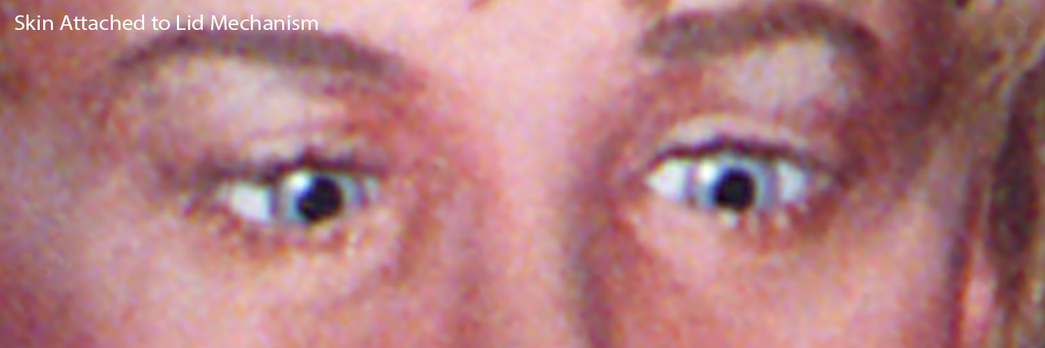
As an alternative, the lid can be integrated directly into the face skin, attaching mechanics to the skin itself to eliminate clearance issues on that side so the only clearance area is between the lid and the eyeball. This would work great except that whenever the head needs any sort of significant repair the skin typically needs to be removed. At that point the mechanical attachment to the skin becomes a weak link, usually increasing the complexity of maintenance work and also putting the delicate features of the eyelid skin at risk. In addition, the types of skin materials available don't really behave like human skin and substructure tissue - the stresses tend to either tear or if designed to avoid tearing, look unsatisfactory. There have been other solutions implemented to mediate these issues and they have been fairly successful, but even then I believe maintenance continues to be a challenge.
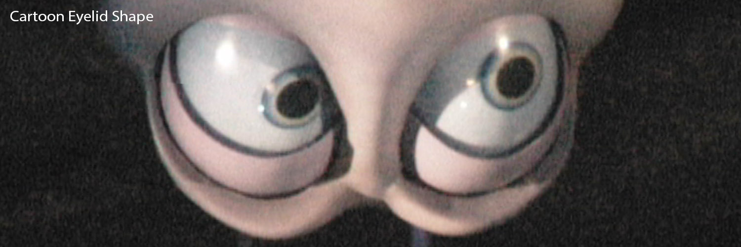
For cartoonish characters it can be even more challenging since the eye shape may not be regular or easily mechanically traversible, making the gaps bigger and sinking the eyeball even farther back into the cavity. Also, when the budget gets scrubbed, complex eye functions are often an early casualty to save other things, so they very often end up spec'd as just an upper lid as a digital pneumatic (open/close) or double-digital pneumatic (surprise/normal/close), similar to the way pupils tend to revert to digital (2-position) or double-digitals (3-position). Of course, the animator would almost always prefer analog control (1000's of positions instead of 2-3).
With the cost savings and expedience of pneumatics (air) comes the "clack-clack" sound that animators and art directors hate. That sound comes mainly from the actuator slamming end-to-end with every movement, but can also come from the solenoids that drive the air valves switching state in the figure base. Another artifact is a much greater chance that when the lid hits the endpoints hard it will look mechanical - and/or broken. That stuff can all be managed in theory, but in practice those issues are endemic to air functions. Additional mediation can be done, but that tends to be done more as a bandaid than a full solution, and often gets lost in the multitude of other priorities during production and installation. As a consequence, it's a good idea to decide how important the lid motion is up front and if a specific level of complexity/performance is critical, and then be ready to fight for it (repeatedly).
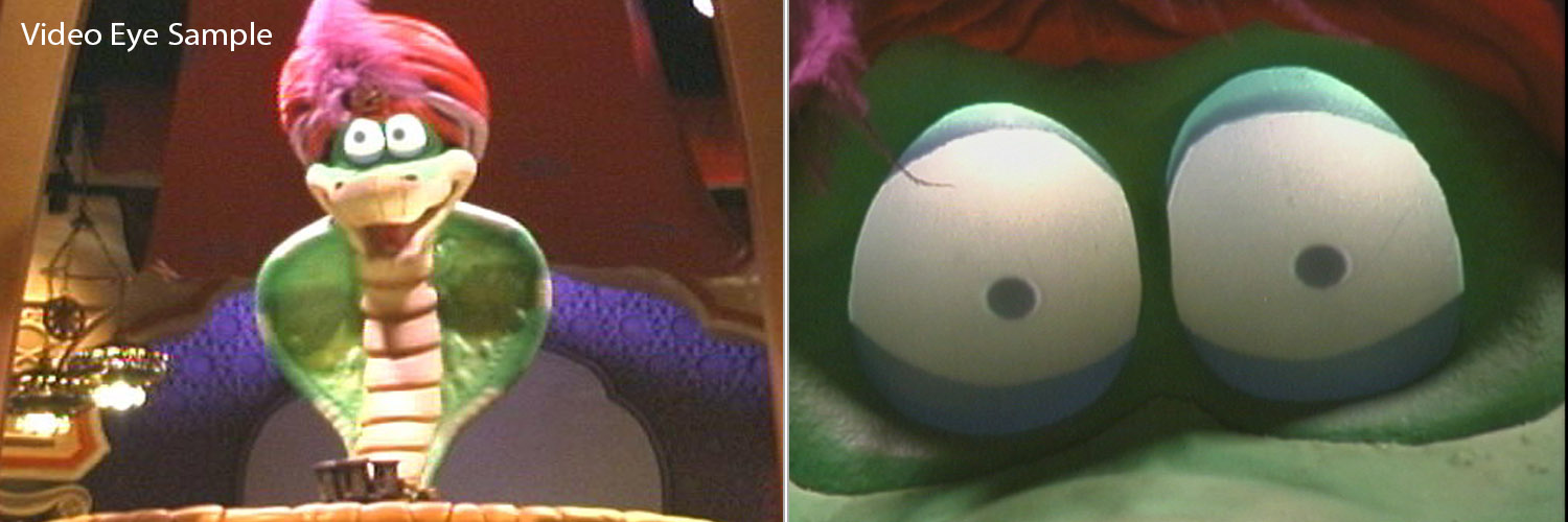
When using video displays for eyes we have a slightly different set of issues. Technically, we can include the lid visual with the media we are streamming to the video eye display and avoid the double-clearance issue all together. Practically speaking though, there is often still an issue of an obvious difference between the skin around the eye and the the projected eyelid. It's less of an issue to have the eyeballs have a different color, texture and luminance, but the everyone expects the eyelid to be made of the same stuff as the surrounding skin, so this differential can be an illusion-of-life-killer.
Basically, we could just stop there and say that when you utilize video eyes it's better to accept the aesthetic loss and imbed the lid animation with the media displayed on the eyes as a fair trade-off from adding offensive gaps at the edges and pulling the eyeballs way back into the head. But I really don't like to accept defeat that quickly...
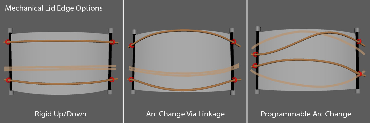
I'm wondering what would happen if we used mechanical design to provide a cue for a "real" eyelid without actually using a fully sculpted eyelid shell. Imagine we have a set of vertical guides hidden behind the eye opening just a little wider than the eye opening. With the regular OLED display curve we are talking about, these would be parellel with each other and with the edges of the display, perhaps attached to the display hardware at the right and left edges. Each guide would have two "transports", little sliding elements with a small, short cylinder attached as a guide for a faux eyelid edge. Then we feed a thin flexible rod through the guides on the upper right and upper left sliding "transports" and another through the lower right and left guides. The transports are moved up and down with actuation to change the shape of the two rods, which act as the edge of the eyelid and are dressed out to look like eyelashes or whatever helps provide a strong visual cue for the edge of the lid. Then, during programming the eyelid media and the lide edge are synced. In theory this could work in a few ways:
1) Rigid Eyelid Shapes: Unchanging straight or arched lid edge shapes.
2) Linear Arc Shape Change: The "transports" could have a mechanically linkage to rotate them slightly as they go from fully open to fully closed to create arc changes. The linkage would probably be on one side with the rod bound to rotate on the side with the linkage and passively sliding in and out slightly on the other side.
3) Variable Edge Arc Shapes: Instead of being a linear mechanical linkage from fully-open to fully-closed, the rotation of the rods would be programmable, allowind the animator to work with a wide variety of eye shape changes.
Now, putting some of my other hats back on, this seems likely to add back quite a bit of the gap we wanted to get rid of, and has a few other downsides. For one, it means four to eight more servos up in the head where we really need to keep the weight down. Secondly, getting something like this to move fast enough to be useful as a blink is a pretty big ask. Thirdly, once we worked out those first two, I'd be worried that the mechanics might be too delicate for the work they have to do to be reliable and maintainable.
In conclusion, I would bet by the time we get something laid out for the entire figure and then pass our ideas off for engineers to evaluate, sacrificing the eyelid visual look so we can just do it in the media will seem like an acceptable compromise. Definitely not ideal, but a way to keep other elements from tanking too badly later in the process.
For the next session we'll start talking in more detail about the mouth and what character design modifications might be helpful.
Design Exercise #1:
Pop-Up Character
part 5: Facial Design Strategy - Video Eyes
Darrin Hughes - April 16, 2021
It's going to take two sessions just to go over some of the basics of video eyes. Then most of rest of next week will be taken up with the mouth, including, I expect, character re-design (which is why I was okay starting with a character and assets that weren't all that strong - I knew I'd need to redo things) which will likely require me to take a bit of a hiatus to re-model, texture and rig. Then the whole process of going through staging, set development, lift design and then performance options will be ahead. Strap in, it's going to be a bit of a ride.
Video Eyes
Viability Check
Before we get too excited about this path, we need to identify what it's going to mean to basic character design for aesthetics and packaging geometry for mechanical design. cheap video displays are flat and rigid. We'll want to get a sense of the topology, what we can live with and what we can't.
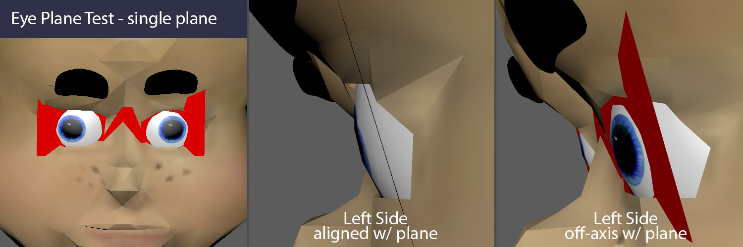
Here's a simple, single plane thrown across the eye opening. We would clearly have to flatten the face significantly to use a single flat panel for both eyes, which would be a major impact on character design. If the character were wearing great big (rectilinear) glasses, that might work, but that wouldn't be acceptable in most cases. Let's see what happens when we use two flat planes...
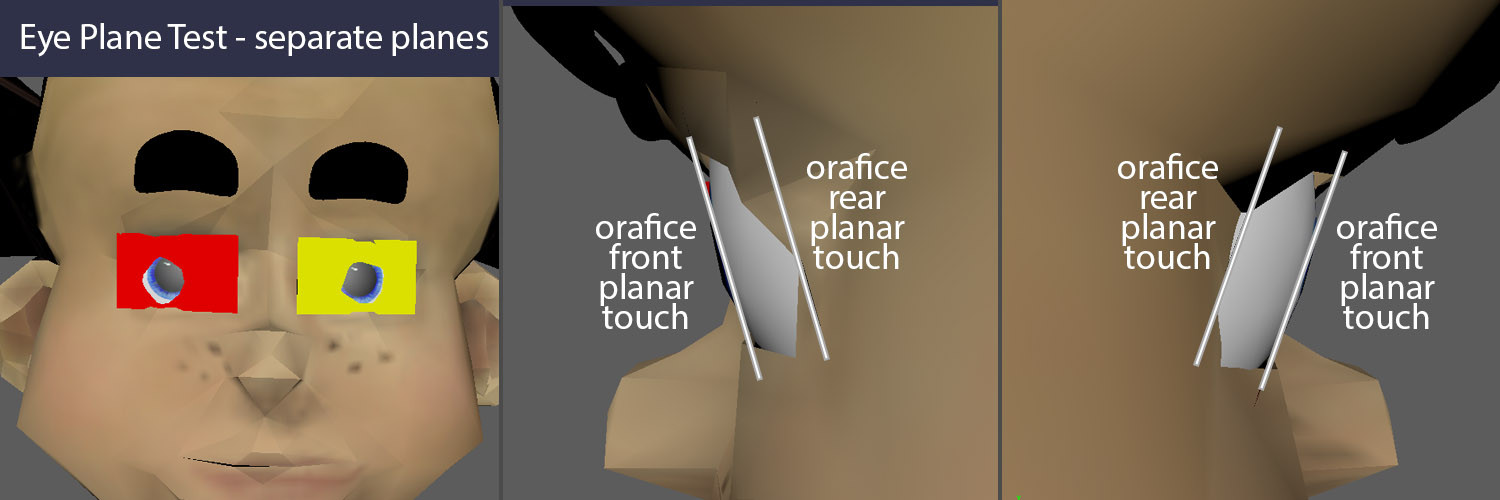
This is a bit better, but there is still a big differential in the parellels between the front and back of the eye socket. Being relegated to a flat plane throws cold water on most character designs. If only we could use a curved plane! Fortunately, in recent years curved and flexible plane displays have come on the market. Let's see how that looks...
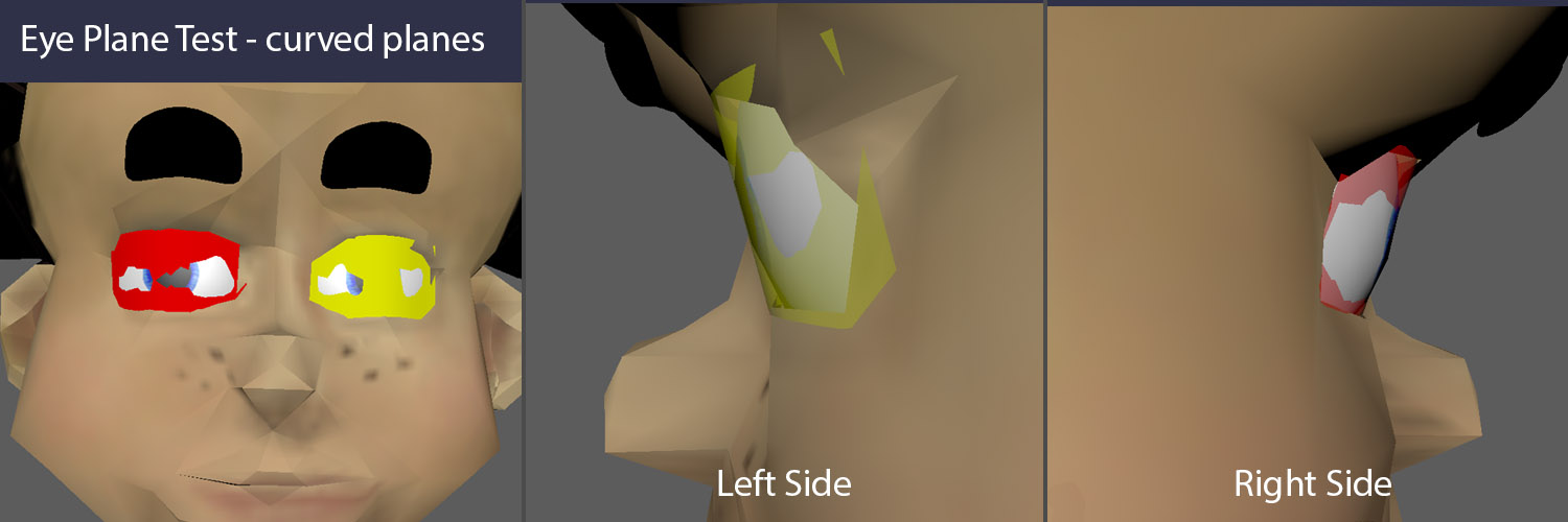
Still some tweaking to do, but it's actually pretty close. If the sculptor knows to use a specific curve for the eye orafices, this could definitely work! OLED to the rescue. Maybe.
Display Hardware
One of the challenges in using video displays is that there are often deal-breaking tensions involved with selecting the hardware. I've already snuck in one of the technology differentiators - pixel emitter technology. LCD is cheaper, flat and available in a wider range of form factors. It also generally has a pretty nasty image clarity falloff as you move away from center, which hurts us. OLED is considerably more expensive, less available in varying form factors, can be incorporated in non-flat shapes more easily and has much better falloff characteristics. But even with LCD, finding an existing, available product that fits the bill and we can purchase isn't usually easy and is sometimes impossible.

OLED seems like a much better path to go down, but now we need to be sure that someone somewhere has manufactured a product that has similar specs to our character. This can be much harder than it may seem. We are not quite in an age where we can just print display hardware in any size and shape we want, it's still a pretty big manufacturing process to embark upon for a short run - and animatronics is always a short run unless perhaps you are designing toys. We should all say a little prayer for smart phones and tablets, because those markets drive display options in the size that we need. Our form factor is small, just a few inches, and we need to be able to package the display in a place where the geometry is usually falling back on at lease one side, so we won't want a big border - at least one edge needs to be almost free of casing, and ideally all four edges should be clean and tight to give us design options. To keep things simple for our scuplting and engineering team, we want to stick to a single axis curve. I believe Flexible OLED is only flexible along a single axis anyway.
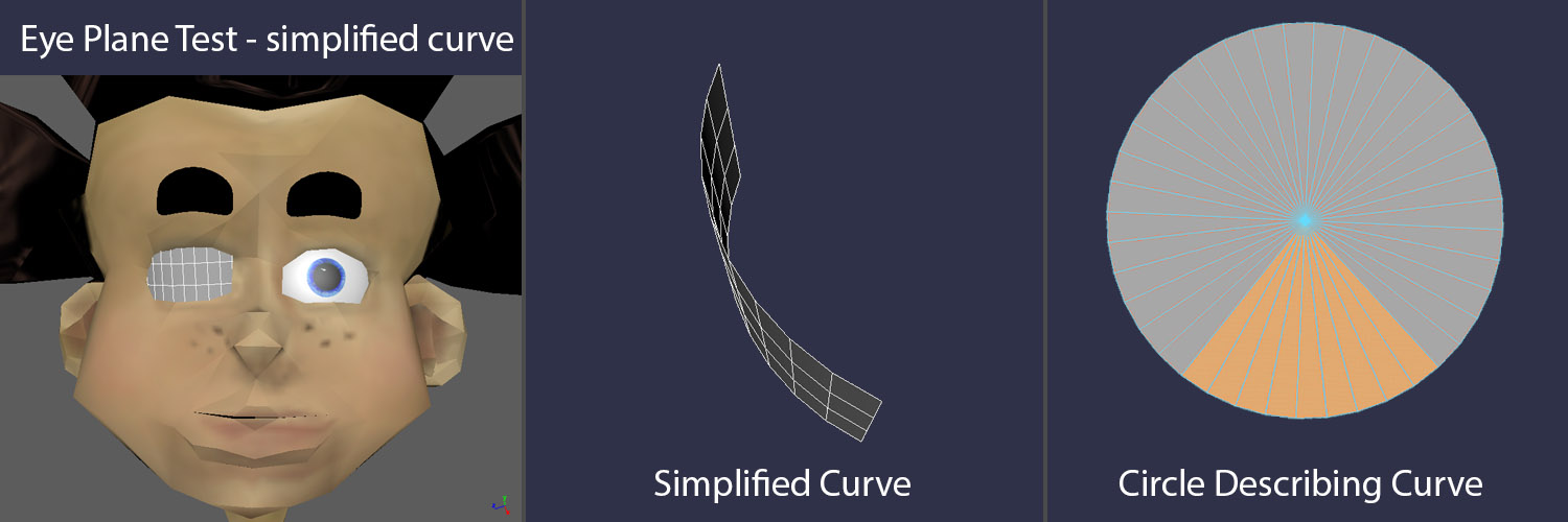
Keeping the curve to a well-defined portion of a circle reduces chances for error - that makes it easier for the sculpting team and the engineering teams to stay on the same page unless there is a compelling reason to do otherwise. Once we reach the point to re-model the head, I will use this shape as a reference to get the eye shape to conform to it.
So all that seems pretty promising. We will need to address control strategy, but let's push that down the road. There is one other thing that I can think of immediately that would go into the mix at this point. Maintenance strategy.
Everything that goes into a theme park is expected to be reliable, as I've mentioned elsewhere on my website, but everything also be maintainable over the course of decades. So if you get a great deal on a couple of video display units that meet all performance, mechanical and control/electrical design requirements you still might put the attraction in a bind if those items can't be replaced in six months, two years, etc. Sometimes that question doesn't get asked until way later in the process.
I should make another admission at this point. Over the years I've become a bit hyper-sesitive to doing as much as humanly possible as early as possible to reduce risk on the back end of the project. I would guess that many of the folks in other disciplines I work with might say that my approach is overkill. On paper, it is certainly true that it doesn't seem like we should be worrying about part availability when we are in Blue-Sky. However, I don't like steering others down blind alleys when a little extra effort can avoid that. Also, I've more often than not been the guy on the other end of the production cycle left to deal with the end result, and I hate to not deliver what I promised. When everyone else leaves and moves onto the next project, it's Guests, Operations and Maintenance teams who will pay the price for every missed opportunity or design failure. I've seen first-hand what a difference playing heads-up ball can make. That approach doesn't really reduce the amount of effort it takes to design and build the figure, it's still damned hard and requires tons of skills I don't possess, but every problem that can be anticipated and designed around when we are working with pencils rather than steel, saves tens of thousands of dollars in extra effort and improves show quality.
For the next post, I'll spend some time talking about eyelids, and particularly how that subject relates to video eyes.
Design Exercise #1:
Pop-Up Character
part 4: Facial Motion Strategies & Character Design
Darrin Hughes - April 15, 2021
Let's talk about some options for how to approach facial movement specifications.
First though, a reminder that we aren't really doing mechanical engineering, or even mechanical design at this point, though it may feel like it. Let's call it psuedo-mechanical design. Ideally, when the project gets to Design & Production, the designers/engineers will have sensitivity to performance needs and keep things on-model, with creative team direction. But even if that is true, they will not necessarily solve problems the same way the animator would - invest in or toss out aesthetic options to accomodate issues, just as I can't approach mechanical design all that effectively. I can still be too conservative or too wacky, often with the same idea. Still, there is a lot of value in thinking through broad mechanical strategies, imperfectly as artists/animators may be at it, so there is a reasonable chance that the expression gamut we are asking for is in the ballpark of doable - we should at least have some understanding of that part of the process.
In other words, it's important to meet the technical design effort half-way, even in the early stages. So that's what we are going to be doing from here on out. Some story and character work at the same time we pretend to apply mechanical design principles and work problems from both ends at the same time, juggling a bunch of design tensions at the same time to see where we might land.
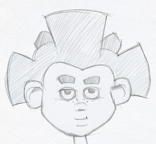
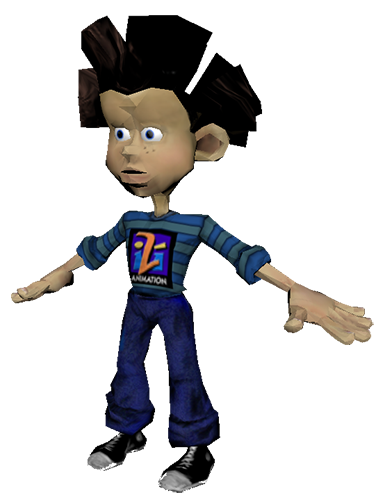
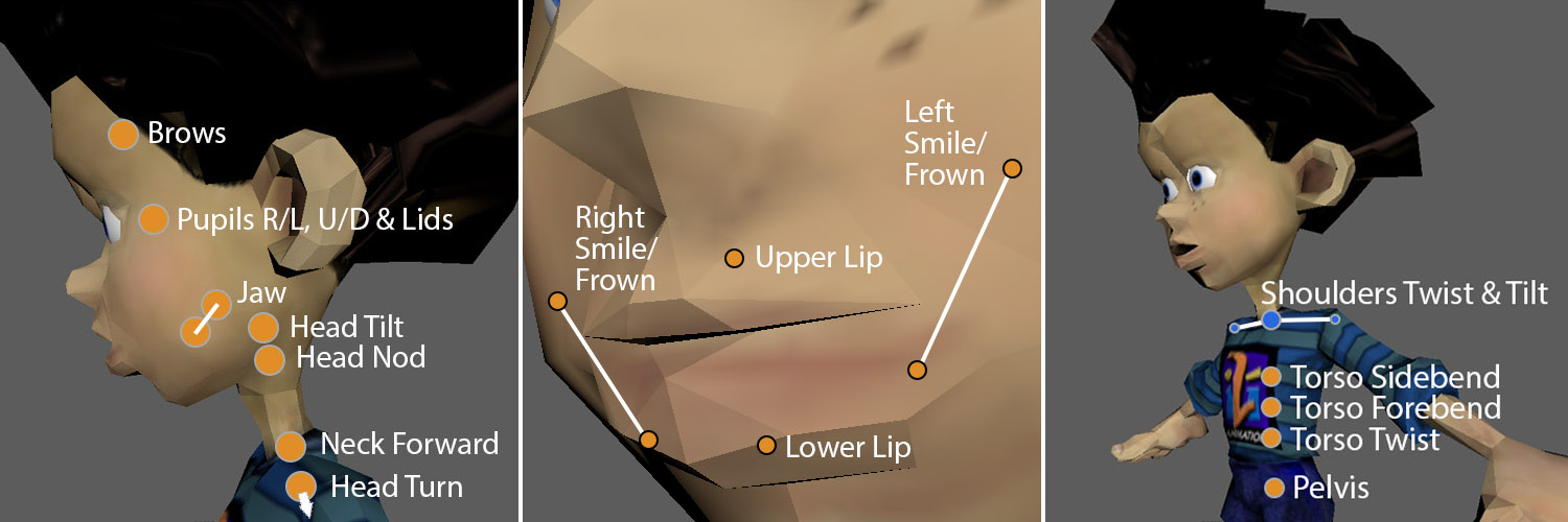
Here's a sketch of Rai's head. We'll start from the top and work our way down. First the hair, then the brows, then the eyelids and pupil motion. Then the mouth and jaw.
I don't actually remember what I was going for when I did this low-res model. I have a bunch of versions of this character. This 3D rig has different proportions than many of the other versions (for another project). That might have been because I was using it for a game prototype and the character was older than my original design, so I aged him up a bit - longer lower face and smaller eyes. Anyway...
I'd like some passive motion in the hair. I hadn't included this yet in the Passive section of the Function List, and it could easily cause complexity and weight issues, but i'd still like to consider it. Rai has these large cog-like (or ray-like) sections that are fairly geometric and have quite a bit of mass. I'd like those elements to give a bit as the head moves around. Not too much, I don't want wobbly jello, just a bit of organic waving.
This video shows what I found a few feet from my desk to use as a movement demo. It's not perfect, and in a real-world situation I would've mocked up a sample mass shape too. However, it's a good example that you don't always need to put a lot of time and money into mockups if quick-and-dirty gets the point across effectively.
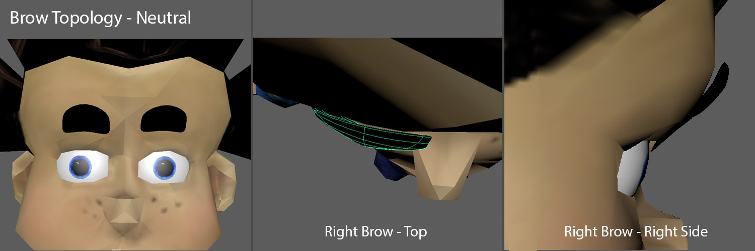
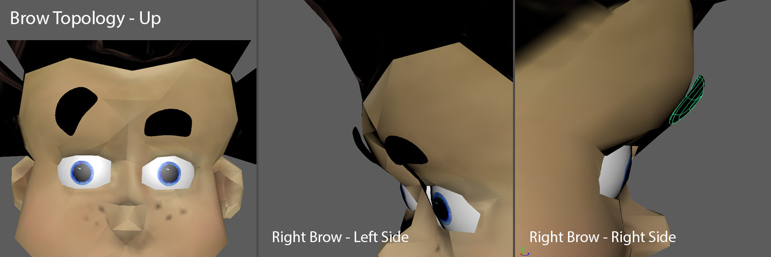
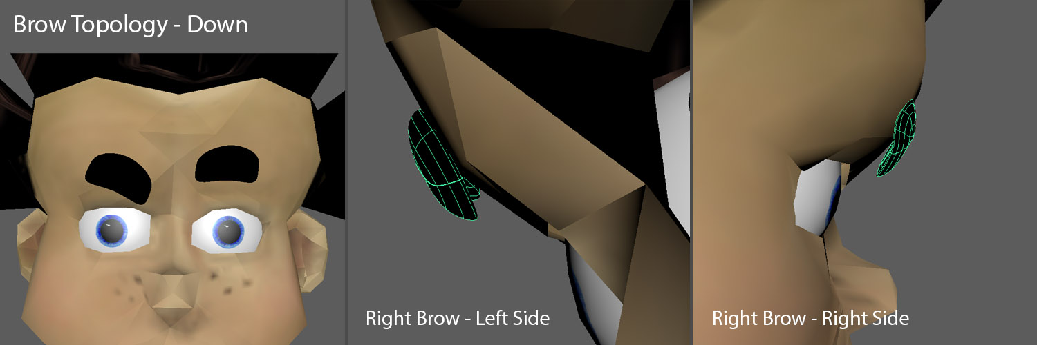
My first thought was to use a flexible material for the brows with another flexible, tapered rod inside. On the Function List I described the pivot as being on the inner side, near the center of the head. For some character designs this is desirable, depending on which expressions are most important, but I quickly realized that wasn't probably a good idea here. I often try to use flexible material for brows to help get more natural arcs.
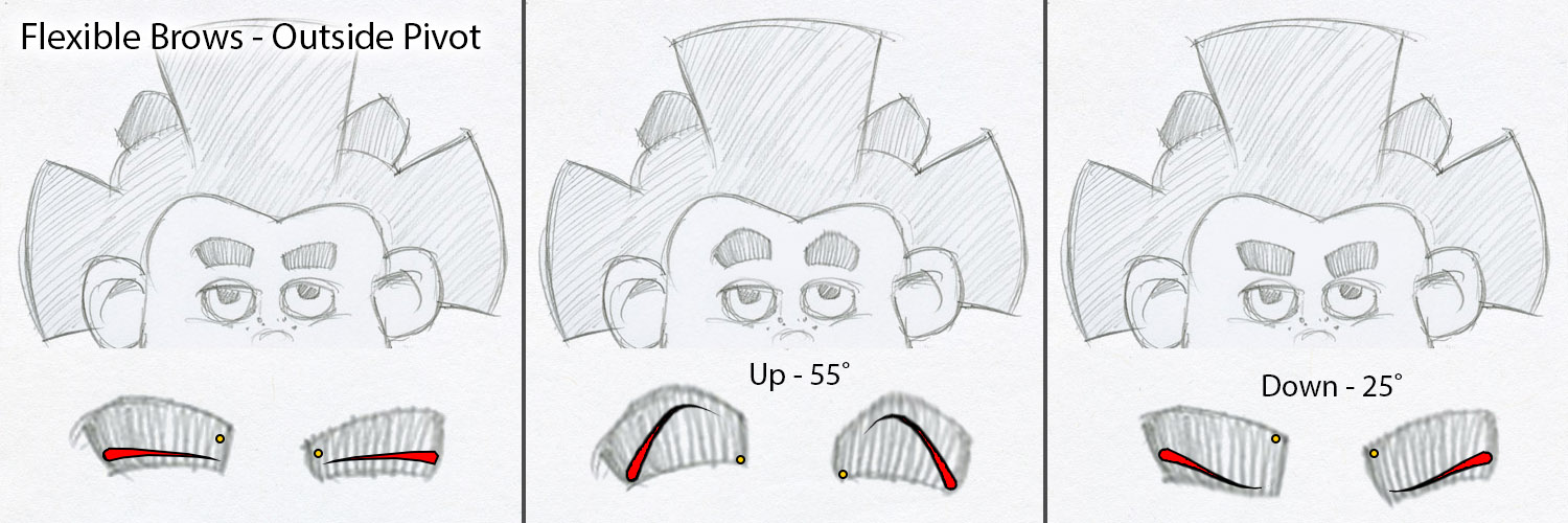

For this I did yet another quick-and-dirty test. This time in Maya, to model a crude eyebrow and then pivot it around to see how it works with the face topology...
I'm going to wrap there for today. I'll move on to the eyes and mouth tomorrow.
Design Exercise #1:
Pop-Up Character
part 3: Prelim Function List and Talk about the Face
Darrin Hughes - April 14, 2021
Function List:
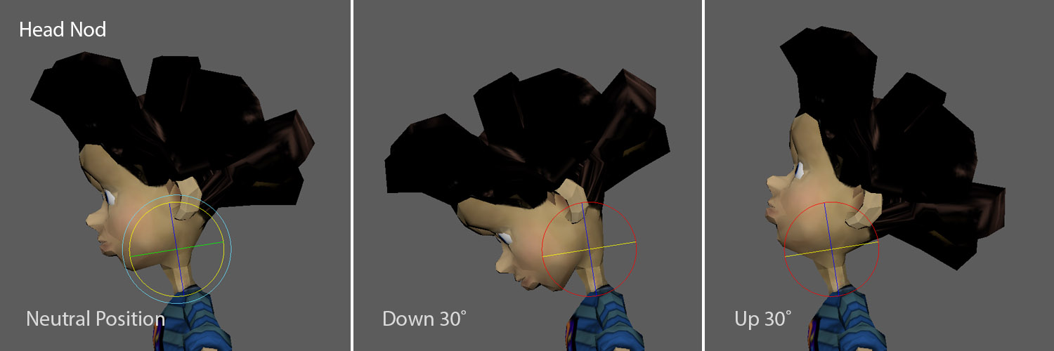
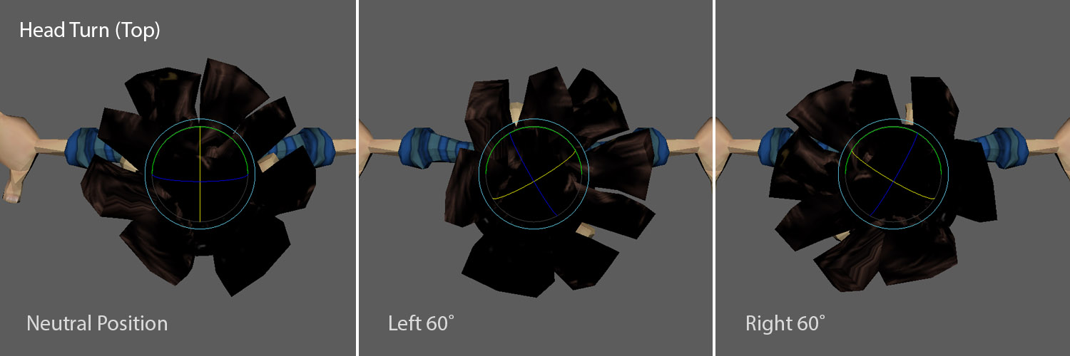
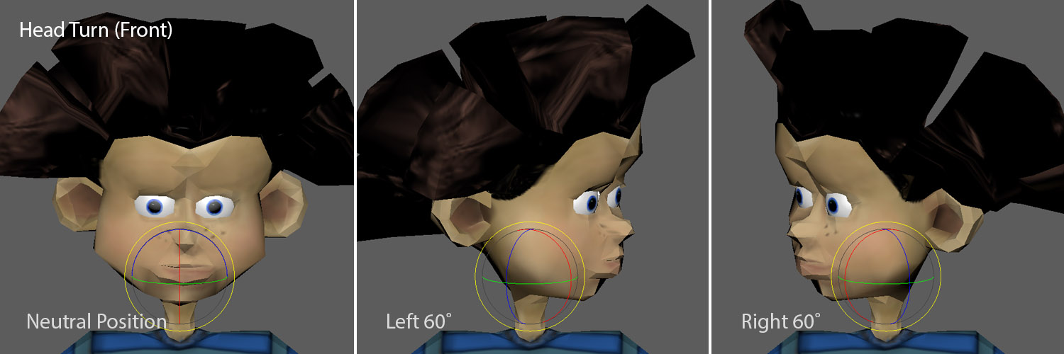
Head
1) Head Nod (60˚)
2) Head Turn (120˚)
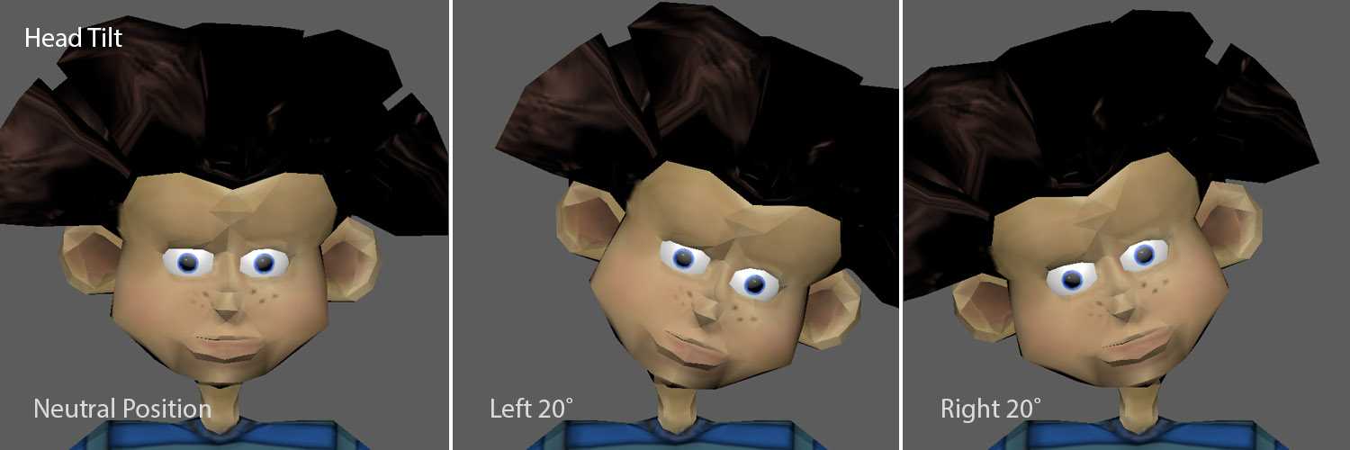
3) Head Tilt (40˚)
Face
...TBD...
Torso
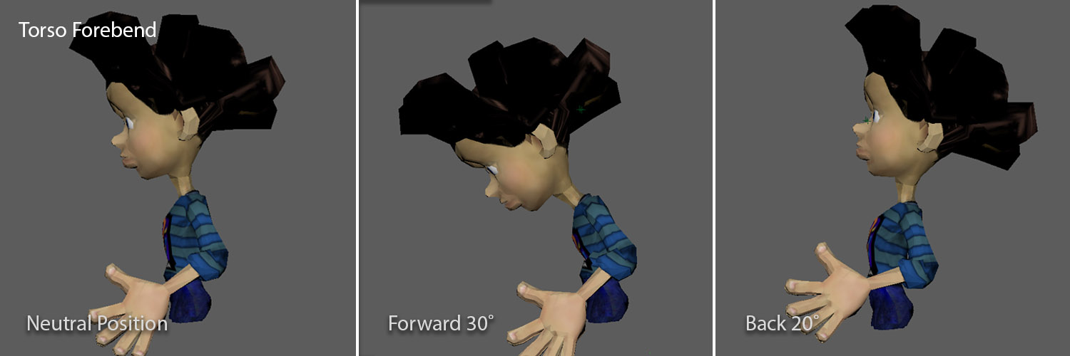
4) Torso Forebend (50˚)
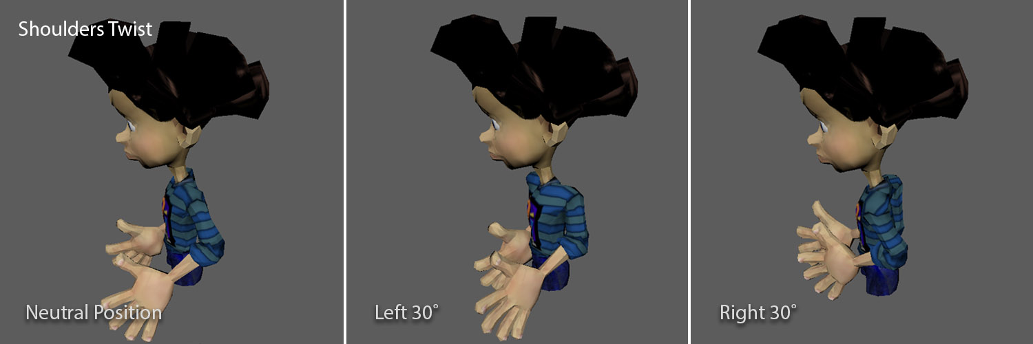
5) Shoulder Twist (60˚) (special)
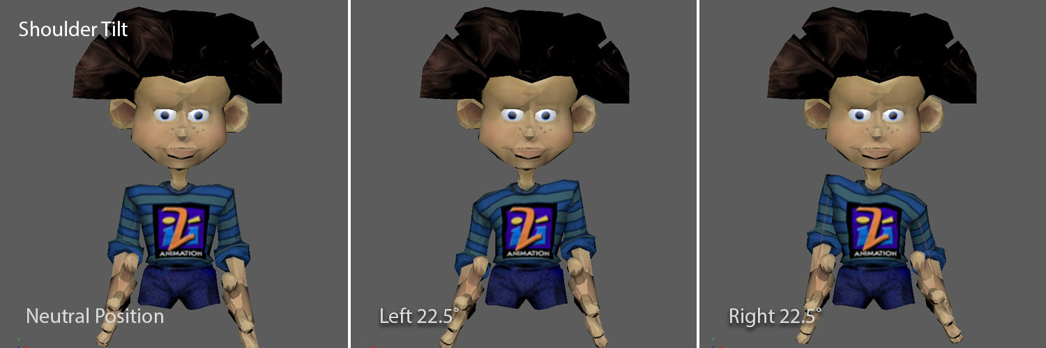
6) Shoulder Tilt (60˚) (special)
Base
7) Lift Up/Down
Passive
P1) Right Arm – elbow and wrist
P2) Left Arm – elbow and wrist
Now, this list isn't locked in stone, its just something to help us wrap our head around various solutions quickly. When we start experimenting with the rig we are likely to try different combinations of functions, pivot placement and range-of-motion, as well as maybe broad changes in staging. This isn’t anything formal, just a scratchpad really. I might only spend a few minutes thinking about an initial functions before I dive into sketching or 3Ding things out to start experimenting. But inevitably someone will be trying to estimate costs at the same time we are dreaming things up, and a preliminary function list is a useful tool to satisfy those requests when they come in – saves me from having to stop and do a bunch of additional legwork when I’m already overburdened. So I like to keep a running tally of high-level specifications, and a preliminary function list is a good one to start with.
But first we need to talk about the face some...
There are a few big categories of design tension to get on the table:
A) Weight – Our hope of bringing the character to life rests pretty heavily on both getting enough animation in the face and having great range, speed and control over the three large head functions. The second of those depends on keeping this great big head as light as it possibly can be.
B) Skin/Figure Finishing – What are we going to make the head out of? Most common skin solutions are going to add too much weight and require too much force (also adding weight in the form of larger actuators and a more robust structure to support them. If we're going to do any R&D for this project, this would be a likely place to start.
The character doesn't have obvious wrinkles of breaks we can use to design his mouth movement with hard shells, although we might be able to handle the brows that way. It's really tough to find a material that can stretch the way we will want to move the mouth and have it continue to bounce back to its original shape.
Being the devil's advocate in most rooms, and knowing how much of a rabbit hole that is, I might suggest we consider modifying the character itself so we have a better chance of success, adding some hard lines to the design. This may give him more of a puppety look, or we could look into adding some form of mask-like element, a Covid mask or change his mouth shape so it doesn't need to do much. In most cases with a real IP on board none of that is an option. But if I'm more interested in performance success than inventing new materials it's not a bad path to follow.
B) Eyeballs & Pupils – When Rai's large eyes are made as spheres, they actually overlap by about 10%. That means, probably, that to stay on-model we will need to come up with some other mechanical strategy than the type commonly used for Eye R/L, Eye U/D, Blink.
Rai's eyes are fairly flat, so it might be possible to use a video display for eye animation if we can find some lightweight monitors that are the right size. There are advantages and disadvantages to going that route.
One big advantage is that it may be possible to get a lot of bang for our weight buck, using the two displays (most likely we'll need two but we might be able to use just one) for more complex pupil animation than we could get out of common Eye R/L and U/D functions. And we might be able to use the video for the lids as well, allowing us to do much more interesting animation.
Now the disadvantages...
First, if we are putting it into a theme park, we have to watch out for patent infringement. Disney has a patent granted in the early 2000's covering video eyes in characters. Video eyes and some other tech concepts covered are based at least in part on work the WDI Tech Dev team did in the late 90's - a team I provided creative leadership for, so it's my own fault. Those patents should last for 20 years and should expire soon, but may still be in force, so we would have to be careful.
Secondly, for all the good things that video brings, it still operates like video. In brightly lit areas it can look washed out or get "glary". Also, whatever playback/control system we might choose would need to be able to sync the animatronic animation with the video, which can be tricky, especially if we start talking about interactive options for the show. And, I've found it very tricky to get eyelids to really read like eyelids when doing this. The lids tend to break the illusion pretty badly.
Using video eyes isn't a slam dunk, but with all of the other design tensions in play, I'd like to see how far we can take that concept before we toss it out. It's possible that we could save a ton of weight going that direction and we're going to need that kind of help soon.
So based on all that, here is my thought on filling in the Facial portion of the function list, at least for the time being:
Face
8) Jaw Open/Close (~30˚)
9) Upper Lip In/Out (~40˚)
10) Lower Lip In/Out (~50˚)
Oh my, I forgot to talk about teeth. This is a really hard element to get to look right, as whatever lip functions we land on are likely to look funny for certain visemes if we don't augment by moving the teeth around to re-enforce positive cues. I'm going to recommend we keep the character "talking shallow" with a small mouth (which he has) and limited range of motion so Guests can focus to much on the inside of his palate.
11) Right Eyebrow Up/Down (~50˚)
12) Left Eyebrow Up/Down (~50˚)
Tomorrow I'll post some images of those facial functions and start to build my MotionBuilder rig to experiment with lift movement and sightlines.
Design Exercise #1:
Pop-Up Character
part 2: Performance Design and Basic Functions.
Darrin Hughes - April 13, 2021
We haven't gone over show timing or performance layout yet, so for now let's assume, just to have something to work with, that Rai will...
(1) ocassionally pop up as if he is startled by something,
(2) look around,
(3) deliver 1-3 lines of dialog, then
(4) sink back into his hiding spot.
We'll assume that he has a fairly dynamic, energetic voice and just to maintain some design sanity, that he'll deliver his lines at a moderate speed - no machine-gun delivery. We want the figure to be able to keep up with the dialog so they work together well.
Something we want to avoid is having the finished figure appear 'flat'. There needs to be enough compound movement to bring a character to life. Here is a Snowball figure that has primarily planar head motion that is slow and sparse for the dialog (you'll have to imagine that, since I muted it) and there isn't any juxtaposition with the body - all focus is on the eyes and mouth, weak areas for animatronics that scream for misdirection support. This is in a queue, where Guests have a moment to stop and stare, and they aren't far away, so scrutiny is pretty high.
The point is that there needs to be a balance in the functions that make up a performance. Too much reliance on just eyes and mouth and you'll only be able to hold the stage for very specific staging options for a pretty short amount of time. For a full-sized, fully-loaded human figure the common functions available really only are effective at keeping the upper body, arms and head alive - the hips and legs only provide supplementary movement that help the chest and shoulders move appropriately. It's best to hide the lower body or de-emphasize it as much as possible unless extraordinary steps are taken. In this case, we are mainly selling the face, but similarly need the larger head controls and some support from the torso to keep the figure alive for most staging situations.
And so we come to a dilemma. We would like to have facial expression functions to break the common expectation that animatronics have puppet mouths and dead, mechanical-looking eyes. That is a very important design objective. At the same time, we know that our giant head on a pencil neck needs good control for the three main common head functions, Head Nod, Head Turn and Head Tilt. Now, human heads have a more complicated motion gamut than those 3 axis, but I can say with some confidence that even if we just go with commonly used functions we will be hard-pressed to build a working, reliable figure based on the stated project requirements. I guess before I get any farther I should identify common animatronic functions that are going to be applicable to this discussion:
Basic Common Functions - The orange dots represent axis that most animatronic developers and vendors are familiar with.
Head Functions
• Head Nod - Rotation near the base of the skull on the X-axis (Y-up).
• Head Turn - Rotation on the Y-axis (Y-up) below the Head Nod (order matters).
• Head Tilt - Rotation above the Head Nod on the Z-axis (Y-up).
• Neck Forward - Rotation on the X-axis (Y-up) at the base of the neck.
Torso Functions
• Torso Forebend - Rotation near the stomach on the X-axis (Y-up).
• Torso Twist - Rotation on the Y-axis (Y-up) below the Torso Forebend (order matters here too).
• Torso Sidebend - Rotation above the Torso Forebend on the Z-axis (Y-up).
• Pelvis - Rotation on the X-axis (Y-up) at or just above the hips.
Facial Functions
• Jaw - Rotation between the organic jaw pivot and a point forward on the X-axis (Y-up).
The result tends to be that the Jaw function has to try and cover all of the things the mouth does. Putting the pivot back at the natural jaw pivot point just makes it look terrible if that's the only function you have. So we move the pivot point forward so if you squint it might look like its a little bit of lip motion along with the jaw movement. And then we have to animated the figure to help with that conceit - skipping some syllables and accentuating others to try and make the lack of complexity any more noticeable than it has to be. It's an imperfect solution, but one that still takes quite a bit of care and craft to make it more, rather than less, effective.
• Lip and Smile functions - The mechanical strategies can vary dramatically.
Note: The 'neutral position' can mean a few things and I'll elaborate at another time - but here I'm talking about the position of no-resistance for the face skin/fur that should correlate to a neutral expression that the figure remains in when it isn't active. .
• Pupil Right/Left & Up/Down - R/L on the Y-axis and U/D on X (Y-up).
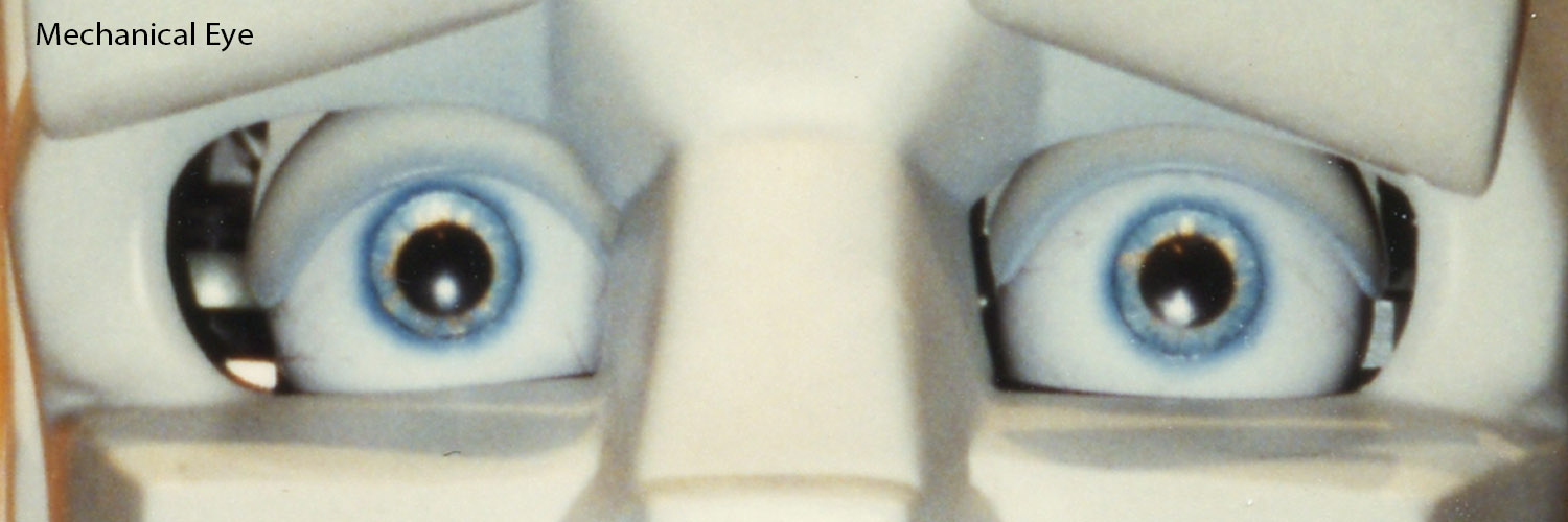
There is a basic rule of mechanical design for high-duty-cycle applications (like theme parks): Things that move can't touch other things. This is an extremely unfortunate rule and maybe the one that has the most significant impact on animatronic design. It certainly is problematic when it comes to the mouth and eyes. Basically, there has to be a gap between the eyeball and the lid. And if the eyelid is a separate mechanism from the face skin, there has to be a gap between the lid and skin. These gaps look awful. Our eyes constantly 'lube' our eyeballs to maintain a nice smooth surface for our eyelids to rub against, and I suspect that there is still an awful lot of cellular upkeep to keep our lids and eyeballs in proper working order. We don't get that (yet) in the mechanical world, so even with tight tolerances eyes still look pretty nasty.
And that is for normal human eyes. Abstract characters break lots of physics rules, with non-spherical eyes that can't easily rotate on two axis, and even if they could, would have the eyeballs collide inside the head. The result is often less range of motion of the pupil, which is exactly the opposite of what abstract character need to stay on-model.
• Eyelids - Rotation on the X-axis (Y-up).
• Brows - The mechanical strategies can vary quite a bit.
Abstract characters ratchet up the difficulty tremendously, as cartoon eye expression breaks lots of rules to exaggerate all the small, subtle cues in human expression. Cues that originate with a slight furrow and knit get abstracted into changing eyelid shapes to accentuate anger/focus along with having the entire brow ridge collapse down over the eyeball. Cartoon vocabulary completely re-writes the real-world motion for dramatic impact, and that then has to, somehow, be designed into our physics-contrained mechanical design. Some days that just seems incredibly unfair. To the point that we look for other ways to address eye expression. More on that tomorrow.
Wow, this got long fast. Tomorrow I'll discuss how these functions apply to my sample character and prep for some initial 3D motion tests in Part 3.
Design Exercise #1:
Pop-Up Character
part 1: Overview
Darrin Hughes - April 12, 2021
There are quite a few applications and they can vary quite a lot in their design requirements. Pop-up figures might be useful for parade floats, location-based events, in-park area development, retail, and other applications. They could be considered inherently lighter and less mechanically robust than typical animatronics, and are likely to require more frequent maintenance. That can be managed with a careful design approach, but does change the calculus significantly.
One example is a project I did in 2001 involving a walkaround Pocahontas carrying a basket with a Meeko hidden inside. She carried it into a small theater space and then told a story using Meeko’s behavior as analogy. Below is a clip of a performance test done at DCA.
In that specific project the container was dressed out as part of the show. Meeko was designed to support a specific script and also pop out for photo-ops with Guests after the show, but could have been programmed to support more variability in presentation. All elements, figure mechanics, power, playback, audio, communications and f/x were packaged within the basket. The mechanical design was specific to Meeko and his performance needs – the concept would have applied to other applications, but we didn’t specifically generalize the design for a broader set of characters and performances.
During the Blue-sky on a studio-driven project, my role initially would be to listen a lot - getting an understanding of high-level stakeholder requirements and gently help steer ideas based on experience, risk and opportunity. Design considerations include IP (intellectual property - any existing characters owned by others and licensed to the project), practical show design parameters, ride design, R&D technology breakthroughs, short and long-term park development strategy, THRC (Guest throughput) targets, and dozens of other factors. Basically, there are inputs coming from all directions at once. Most ideas end up in the trash bin. Finding ideas that have legs with the myriad of competing half-baked and brilliant thoughts (often both at the same time) is no small feat, and this all happens in a very brief period of time - everything is changing dramatically daily. Doing all this with a sizeable creative team is part of the magic and miracle of this type of work. It's a messy process.
But for this little sample effort, I’m going to set somewhat arbitrary technical and performance boundaries so we can focus on some of the details regarding how figure target decisions evolve.
• Talking Heads - Expose Head and shoulders only. Any Torso motion is really to make the head look viable and imply that there is a whole character out of view.
And to reduce the need for a base turntable or similar additional functions to accomodate a huge range, a 120 degree viewing area generally centered on the front middle of the figure is decent. That gives us something to shoot for when we start to figure out functions and ranges that keeps things manageable. Note that if there is an interactive requirement, the function ranges can get eaten up pretty quickly, requiring larger range of motion specs to permit character animation in conjunction with orientation control to keep the control scheme from getting crazy.
Tomorrow, I will be taking these initial baseline design assumptions and start working through some performance options - looking at function groups with notes on design risks and opportunities. That will be mostly an aesthetic discussion, but technical issues will creep in as well.
I'll also touch on the way these initial constraints might impact different character types, classes and IP's. Hmmm, sounds like I just described a thick book worth of subject matter. I'll have to breeze over some of it to keep things moving.
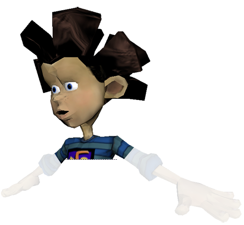
I'll use an old character I created back in 2003 (just because I own the IP - so as not to upset any lawyers). His name is Rai (way before the the Star Wars character was out) and I'll use a low-res game rig I did for him to work through some quick-and-dirty pre-vis performance and mechanical design options in the following posts.